


To help developers stay ahead of the latest trends in web development, we have compiled a list of the best CSS frameworks that are currently used by professional experts in the field:
A good technical consultant specialized in front-end development (UI) should know different tools and technologies available in the market because they may have to deal with different clients for Web Design Frameworks (or Responsive Web Designs) and Development with out-of-the-box capabilities for customizing their components during the development phase.
To make the responsive web/website look good on all platforms like Desktop, Mobile and Tablet, etc, Responsive Web Designs (RWD) use HTML and CSS. RWD is not a JavaScript nor a Program.
Table of Contents:
- Simple CSS Framework List: Must Read
- What are CSS Frameworks?
- Types/Categories of CSS Frameworks
- How to Choose the Right CSS Grid Framework
- Cross-Browser Compatibility Using Lightweight CSS Framework
- List of the Best CSS Frameworks
- Comparing the Most Popular CSS Frameworks
- Frequently Asked Questions
- Conclusion
Simple CSS Framework List: Must Read
HTML, CSS & SASS, and JavaScript languages are fundamental technology stacks used for web development, each has unique features to serve.
HTML – is Hyper Text Markup Language used to create the structure of web applications and static web pages (describes the content of web pages only).
*CSS is a Cascading Style sheet language for presenting and styling web pages or documents written in HTML or XML CSS can control an entire website’s multiple web pages. Hence, CSS is critical, modern, and widely used for building pleasing Websites/web applications.
*SASS – Syntactically Awesome Style Sheets is an extended version of CSS language that serves as a pre-processor
JavaScript – is one of the popular scripting languages for adding interactivity and dynamic content to web pages/ web applications.
What are CSS Frameworks?
Suggested Read => Top CSS Editor to edit the CSS code easily
Frameworks are the foundation that eliminates coding from scratch, providing pre-built components and standard structures that we can build upon or make use of during web design and web development.
CSS Frameworks are pre-defined styling sheets, layouts, or libraries that web designers and web developers can make use of during the development of front-end applications without writing the CSS code from scratch.
These pre-defined styling sheets already have the standard web designing functions, built-in classes, structure, IDs, and templates like setting background colors, fonts, footer, hamburger menu, navigation bars, layouts, etc., as well.
These can be customized and expanded using other scripting languages like JavaScript, and SASS (Syntactically Awesome Stylesheet) and developers can make use of these readily available templates to design their websites and set up web pages swiftly.
Hence, CSS Frameworks are widely used to save time and effort in generating user-friendly and picturesque UI by web developers and web designers.
There are several CSS Frameworks available to complete web application projects without much worrying about responsive web designs. Below are listed the most popular and in-demand CSS Frameworks, including the Best.
Types/Categories of CSS Frameworks
To simplify the web development and the styling involved, CSS Frameworks provide pre-built libraries, designs, UI Components, responsive grids, and Utility classes. Hence, based on their styling approaches, CSS frameworks have been categorized into different types, such as:
#1) Utility-First Frameworks: This category framework is for building the styles and designs directly into HTML codes without writing the custom CSS, which emphasizes atomic classes. Example: Tailwind CSS.
Some key features:
- Not relying on predefined components
- Minimalistic with highly custom facility
- Performance and scalability-oriented
- Class Utilities for Inline styles are highly encouraged (ex: px-4, text-centre, flex)
#2) Responsive Design-First Frameworks: These Frameworks are optimized for responsive designs and mobile-first approached applications. Ex: Bootstrap for mobile-first approached CSS framework, Pure.CSS
Some key features are:
- Grid System is a highly simplified version
- For responsive layouts minimal and lightweight
- Faster loading and performance are priorities
#3) Component-Based Frameworks: This category framework, mainly for the component-driven development phase, is modern and integrates seamlessly with JavaScript Frameworks like Angular, Vue, and React. Example: MUI (Material UI), Chakra UI.
Some key features are:
- Integrates with JavaScript Frameworks
- Built-in themes for design systems along with support
- Advanced accessibility features
- Functional UI components are pre-designed.
#4) General-purpose Frameworks: General-purpose frameworks provide a wide range of tools that are comprehensive for visually appealing designs and responsive designs. Example: Bootstrap, Bulma, Materialize, and Foundation.
Some key features are:
- Utility classes & built-in themes
- Responsive design capabilities
- UI components like modals, navigation bars, and buttons / (CTAs-Click to Action)
- Flexbox layouts or grid-based systems
#5) Minimalist CSS Framework: Minimalist CSS Frameworks are lightweight and provide ‘the essentials’ only for designing and styling without using extra utilities or components. Example: Milligram CSS and Spectre.css.
Some key features are:
- Very simple and clean designs
- Not Relying heavily on JavaScript or not on any complex dependencies
- Faster loading times with smaller file sizes
#6) Thematic Frameworks: Thematic Frameworks focus on some specific designed guidelines and themes. Example: Materialize design by Google, IBM Carbon Design System, Metro 4 UI Design.
Some key features are:
- Branding standards are maintained with consistency.
- Material Design by Google
- Design Systems are based on Thematic or Corporate guidelines.
Statistics: Based on the current popularity rankings on GitHub star ratings and npm downloads below frameworks are gaining popularity in 2024:
| CSS Frameworks based on Rankings | GitHub Star Ratings | npm Downloads Weekly basis |
|---|---|---|
| 1. Tailwind CSS | 75k+ | 10 million + |
| 2. Bootstrap | 160k+ | 2 million + |
| 3. Materialize CSS | 38k+ | 100,000+ |
| 4. Foundation | 29k+ | 100,000+ |
| 5. Semantic UI | 50k+ | 60,000+ |
| 6. Bulma | 50k+ | 400,000+ |
Developer Surveys based on CSS framework Usage (ex: Stack Overflow)
| CSS Frameworks | Approximate Results state in Percentages (%) | Satisfaction |
|---|---|---|
| Tailwind CSS | 65% | 85% (8800 companies using this framework) |
| Bootstrap | 52% | 65% |
| Materialize CSS | 10% | - |
| Foundation | 8% | - |
| Semantic UI | - | 60% |
| Bulma | 18% | 78% |
Recent Developers Survey states
For detailed info on CSS frameworks Market share please refer the official site here

How to Choose the Right CSS Grid Framework
Besides the Project’s design requirements, its scope on long-term goals, team experts, and demands on customizations, the following key criteria are considered when choosing the right CSS frameworks for efficiency and standard user experience, such as
- Identifying the team sizes and project sizes
- Project requirements to be determined
- Desired levels of customization stages
- Browser Compatibility Requirements checks
- Performance needs assessing
- Evaluating Resources and Community Supports
- SEO Requirements and Friendliness
Cross-Browser Compatibility Using Lightweight CSS Framework
As Web Technology evolves, using the best practices for cross-browser compatibility with reliable Frameworks will drive, and ensure a smooth and consistent experience across a wide range of browsers and devices. Hence, when using CSS frameworks, below are the best practices for cross-browser compatibility:
- Using CSS Reset (Normalization file)
- Regular checks on multiple modern browsers
- With limited features enabling graceful degradation
- Progressive enhancements
- Feature detection libraries should be leveraged.
- Relying on the frameworks that provide consistent styling rather than opting for CSS hacks.
- Use the Autoprefixer tool: for adding vendor prefixes automatically such as -o-, -ms- -webkit-, -moz-
- Avoiding complex animations
- Icons and Fonts libraries across modern browsers
- Use Fallback for New CSS properties.
- Minimize JavaScript dependency for CSS styling and layouts, and use dynamically when necessary.
- Using Cross-Browser Testing tools like BrowserStack and LamdaTest etc
- Most importantly, check on the Framework’s Compatibility Documentation.
List of the Best CSS Frameworks
Below is a list of the top CSS frameworks for developers.
- Bootstrap
- Tailwind CSS
- Foundation
- Material UI
- Materialize
- Bulma
- Miligram
- Chakra UI
- Semantic UI
- Pure CSS
- UIkit
- Ant Design
- Vanilla
- Skeleton
Comparing the Most Popular CSS Frameworks
| CSS Frameworks | Descriptions of CSS | Features | Best For which level projects | Customizations available | Browser Compatibility Checks | Documentations | Community Support |
|---|---|---|---|---|---|---|---|
| Bootstrap | Most popularly used, Focuses on Utility, for quicker setup | Pre-built utilities, components, grid and JavaScript Plugins | Enterprise Apps and quicker prototyping | High, Supports SCSS | Excellent, but partial support for IE11 | Beginner-friendly and Extensive | Very large |
| Tailwind CSS | Highly Customizable, Utility-first framework | Responsive modifiers, purging CSS file size, Utility Classes | Custom Designs | Very High | Only Modern browsers | Comprehensive with extensive guidelines. | Large and Active |
| Foundation | Professional grade Framework from ZURB | JavaScript Plugins, Flexbox Utilities Grid, Motion UI | Enterprise level projects, Accessibility apps | High, supports SCSS | Excellent but partial support o IE11 | Extensive with examples | Medium but with solid resources |
| Material UI | React-based Framework, based on Material design principles | Themes, Responsive layouts, React Components | Material design based Apps, React- based projects | React-Focused, Very High | High for most of modern browsers | React-oriented Comprehensive | React ecosystem, Large, Very Active |
| Bulma | Modern Framework with flexibility, and Lightweight | Flexbox based, customizable themes, modular, Responsive Grid | Simple and Minimalistic designs | Moderately | High for modern browsers | Easy learning and very well Documented | Medium in size but a growing community |
Detailed Reviews:
Let us elaborate on the main features, how to use these top CSS Frameworks, pros & cons, and more detailed information on the top CSS Frameworks for developers below.
#1) Bootstrap

Bootstrap is one of the open-source(free) front-end-framework for swift and easier website development developed by Twitter primarily to provide the choices of adding colors, fonts, layout, and sizes including basic styling of all HTML Elements.
Bootstrap comprises HTML, and CSS design templates for buttons, tables, navigation panes, image carousels, modals, and many more along with the choice of JavaScript Plugins which help developers the ability to create Responsive Web Designs easily. It is ideal for cross-browser compatibility testing and responsiveness checks projects.
Responsive Web Design, here means, creating websites that align automatically on all devices including small native devices (Phones, Tablets) to desktop platforms to look good and be user-friendly.
How to use Bootstrap:
To start using Bootstrap on your website development there are 2 ways it can be done,
Firstly, Download the latest version from their official site
1) Downloading Bootstrap from official site getbootstrap.com
2) Including the Bootstrap from CDN
Bootstrap 5 is the latest Version (Bootstrap 4 and Bootstrap 3 are older versions for any of the major /crucial bug fixes)
For more information follow the guidelines on the official website:
https://getbootstrap.com/docs/5.3/getting-started/introduction/
“Containers” are the main fundamental blocks /elements of Bootstrap which contain pads and help in aligning the content within respective viewports or devices.
Bootstrap has 3 containers:
• .container: sets the ‘max-width’& is the default width class which changes at each breakpoint. (Fixed-width)
• .container-{breakpoint}: is for ‘width: 100%’ at the specified breakpoint
• .container-fluid: is for ‘width: 100%’ at all levels breakpoints (Full-width)
Bootstrap uses HTML elements and CSS properties.
An example of a quick start with Bootstrap is illustrated below code:
1. Add HTML 5 doctype or create an ‘index.html’ file in the project’s root folder
2. For mobile devices proper rendering and zooming on touchscreens, add <meta> tag under <head> element. width=device-width is for setting the width of the respective device’s pages. , initial-scale=1 will set the zoom levels the first time when the page is loaded.
3. Bootstrap CSS and JS are made inclusive, before the closure of </body> tag.
4. Containers: to wrap the contents of the site
5. Below code snippet below can be saved as a “.html” file and opened with ‘Chrome’ browser’ or any browser of your choice to see the output.
<!DOCTYPE html>
<html lang="en">
<head>
<title> First Bootstrap demo </title>
<meta charset="utf-8">
<meta name="viewport" content="width=device-width, initial-scale=1">
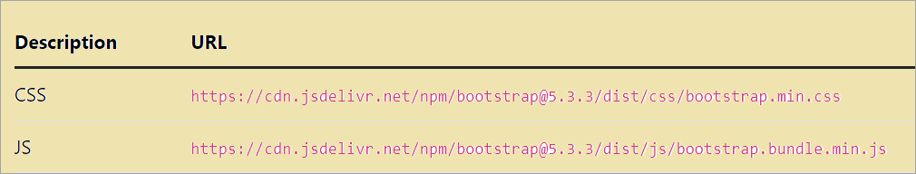
<link rel ="stylesheet" href="https://cdn.jsdelivr.net/npm/bootstrap@5.3.3/dist/css/bootstrap.min.css"
crossorigin="user1">
</head>
<body>
<div class="container"> //can be class="container-fluid" for full-width
<h1>This is my First Bootstrap Page</h1>
</div>
</body>
</html>

Container (Fixed-width), Container-fluid (Full-width)
Why choose Bootstrap?
- Cross-browser compatibility: Bootstrap is compatible with most modern web browsers (Google Chrome, Firefox, Edge, IE, Opera, Safari) ensuring consistency across all the different browsers which is usually a tricky/ challenging task to do. Bootstrap’s CSS and JS components are reducing the time and effort required for debugging to provide more uniform looks across all browsers/end-user experiences.
- Responsiveness/Enhanced grid features toolkit: The grid system is one of the standout facilities/features, which allows developers to create web designs across different screen sizes and devices like tablets, phones & Desktops which works seamlessly.
- Built-in UI components: To increase the functionality and aesthetics of websites Bootstrap’s built-in components are handy and include carousels, tooltips, modals, and navigation bars, for well-organized web designs.
- Mobile First approach: These are the core components of the Bootstrap3 framework. Also, most of the companies opt for a mobile-first approach, as they want their end users to have poor quality experience while looking at their site’s logo and other content which helps in attracting more audience.
- Adding CSS Customized Properties: Bootstrap provides extensive facilities for customization options. Although Bootstrap comes with its default themes, Developers can override default stylings by using their own CSS or SASS variables (default ones) for customizing the framework to meet their business specifications. This robust functionality makes modern websites look more unique and appealing in style.
What we like (Pros):
- Rich sets of pre-built components
- Options for customization
- Consistency across browsers
- Enhanced grid system
- Ease of usage with time-saving capabilities
What we don’t like (Cons):
- SEO performance issues
- Overuse of JavaScript
- Over-dependency on Classes
- Lack of Originality and Uniformity
Website: https://getbootstrap.com/
Suggested Read =>> Bootstrap Forms And Bootstrap 4 Form Validation
#2) Tailwind CSS

Tailwind CSS framework is an open-source and ‘utility-first’ framework used for building the speedy customization of UI components, continuing to be one of the most popularly used special frameworks.
Developers can build using the pre-built-in utility classes of Tailwind CSS to build the customized UI directly in their HTML, offering more flexibility, better control of designs, and efficiency without writing the customized CSS for user-friendly web designs.
Unlike Bootstrap (various pre-defined classes for elements like tables, and buttons), Tailwind CSS provides or creates a list of ‘utilities’ CSS classes that can be used for styling each element on demand. Hence Tailwind CSS is used for Customizable User Interfaces, and responsive designs for cleaner maintenance and is suitable for larger projects.
How to use Tailwind CSS:
To integrate and start leveraging Tailwind CSS’s utility-first classes for styling the components directly into HTML, some of the key steps are listed below:
1. Install Tailwind CSS using “npm”: use/execute the below commands to install & create a JS file.
- Initialize npm on bash terminal > npm init -y
2. To install Tailwind CSS >
- npm install -D tailwindcss postcss autoprefixer
Where, ‘Post CSS’ is a seamless way of integrating with building tools like rollup, webpack, etc. ‘Autoprefixer’, adds prefixes to your CSS automatically.
3. Create a Configuration file for your project
- npx tailwindcss init -p
This cmd will create ‘tailwind.config.js’ file , where Tailwind’s default settings can be customized.
4. Configure the path of the template in the above-created file, ie:‘tailwind.config.js’ <JavaScript file>
/** @type {import(‘tailwindcss’).Config}*/
module.exports = {
               content: [“.src/**/*.{html,js}”],
               plugins: [ ],
}
5. Adding/Set up Tailwind directives for your main CSS file
Example: your file name is: ‘src/input.css or src/styles.css’, in here add ‘@tailwind’ directives for the main CSS file. This will help in loading the Tailwind’s default styles and also make the all different utility classes available.
@tailwind base;
@tailwind components;
@tailwind utilities;
6. Start the Build processing on the cmd line/Terminal with whatever is configured in the ‘package.json’ file, using the cmd > npm run dev
7. Now that, Tailwind CSS is installed and configured, the next step is to start using those utility classes directly into HTML for styling the elements by adding a compiled CSS file(output.css) under <head> tag.
<div
class="bg-blue-600 text-white-700 font-bold p-4 rounded-lg">
Tailwind CSS is a Special Tool!
</div>
- bg-blue-600: To set a blue background.
- text-white: To set the text color as white.
- font-bold: To Make the texts bold.
- p-4: To add padding on all sides.
- rounded-lg: To add rounded corners.
Why choose Tailwind?
- Just-In-Time (JIT) Compiler mode: To make your build faster and more efficient, JIT mode can be enabled which compiles all of your classes as and when used them. Although by default the latest version of Tailwind comes with JIT enabled automatically, to get this ‘tailwind.config.js’ file should be set up first.
module.exports =
{
 mode: 'jit',
content: [ "./src/**/*.{html,js}", ],
plugins: [],
 }
- Highly Customizable: Default configurations of Tailwind CSS are easy to customize by using the ‘tailwind.config.js’ file, which enables stylings, spacing, palettes themes easy for desired customization.
- Dark mode Support: Dark mode is considered a First-Class feature of many operating systems as mentioned in Tailwind CSS official documentation. Tailwind is enabling the ‘dark’ variant which lets to style your website uniquely whenever the dark mode is enabled. For detailed steps to incorporate in your js file follow the guidelines from the official site: https://tailwindcss.com/docs/dark-mode
- Utility-First Designs Fundamentals: Tailwind provides a wide range of tiny pieces (utility classes) that can be used in the desired way to create unique and personal designs of websites. Unlike predesigned components, styles are added directly to HTML elements to make the process clean, clear and direct approach. This is similar to building the LEGO blocks.
- Responsiveness design utilities: responsive designs/ utility classes are making the sites look uniform and good on all kinds of devices.
What we like (Pros):
- A complex responsiveness layout can be built
- Component creations are easy
- Highly customizable
- Swift development is made easy
- Uniform consistency across the websites.
What we don’t like (Cons):
- Headers and Navigation panes components are missing
- Requires skilled resources to understand & how to implement the utility classes
Website: https://tailwindcss.com
#3) Foundation CSS Framework

The foundation is one of the free responsive frameworks for front-end development and is a professional-grade CSS framework by ZURB used for creating web applications and desktop responsive websites.
The main focus of this Foundation framework is on accessibility versatility and performances of larger or Enterprise projects.
As per Foundation documentation states that this responsive framework is a powerful, flexible, and highly advanced framework in the world. It has optional features /functionalities provided by the JavaScript extension and covers typography, CSS UI elements, forms, etc.
How to use Foundation CSS:
Foundation CSS provides an advanced responsive grid system, utility classes, and pr-defined components which makes it a good choice for enterprise projects. How to get started with this framework is listed below, also it provides 2 ways to set up your project:
Option 1:
1. Initialize the npm (if not done already)
npm init -y
2. Install ‘Foundation-sites’(CSS Framework) along with any required dependencies
npm install foundation-sites
Option 2: Use CDN for quicker Prototyping
3. To test the foundation quickly testing below link can be inserted in <head>tag section of HTML File
<link rel=”stylesheet” href=”https://cdn.jsdelivr.net/npm/foundation-sites/dist/css/foundation.min.css”>
4. HTML Structure is set up: making sure CSS and JavaScript files are linked correctly in the HTML structure.
5. Using Foundation Grid Systems
6. Components are added
7. Customizing Foundation with SASS stylings
- Install SASS: npm install -D sass
- Editing Foundation’s Saas variables
// custom.scss
$primary-color: #xxxxx; //colour of your choice
@import ‘foundation-sites’;
- Compile Sass
sass prj/src/custom.scss build/foundation.css
8. Using JavaScript Plugins
Why choose a Foundation?
- SASS support
- Advanced Navigation Components and Forms.
- Flexibility on grid systems
- Pre-defined Accessibility features
- Documentation covers larger areas.
What we like (Pros):
- Built-in Accessibility
- Extensive Components Libraries
- Flexibility for the Developers
- Mobile-First Approach
- Active Community and Documentation
What we don’t like (Cons):
- Larger file size
- Limited pre-styled themes
- Fewer built-in Utility Classes
- Steeper Learning Curve
Website: https://get.foundation/
#4) Material UI

Material UI is one of the popular open-source React-based CSS frameworks. Its components library is based on Google’s Material Design principles and implements from the same providing the most improved version of UI library.
Wherein developers can build incredibly stylish designs/ applications with its pre-styled components, utilities, and themes making the responsive web visually appealing in less amount of time.
Material UI is specifically ideal and is built for React-based applications based on Google’s material design, namely E-Commerce applications, other Professional Web Applications, and Dashboards which need modern style and consistency in their responsive interfaces.
How to use Material UI CSS:
To add the Material UI to your desired project, the following steps need to be run on the command line,
1. Installing Material UI
npm install @mui/material @emotion/react @emotion/styled
These @emotion/react and @emotion/styled packages are optional and are recommended for styling purposes in MUI
2. Basic Setting up and usage of it look like below,
import React from 'react';
import { Button } from '@mui/material';

function App() {
  return (
    <div>
      <Button variant="contained" color="primary">
        Hello world with  Material-UI
      </Button>
    </div>
  );
}
                export default App;
- variant=”contained”: represents a filled button style.
- color=”primary”: The primary theme color is applied.
3. MUI Grid System usage
import React from 'react';
import { Grid } from '@mui/material';
 function App() {
return ( <Grid container spacing={3}>
<Grid item xs={14} sm={6} md={3}>
 <div>Column 11</div>
</Grid>
</Grid>
 );
}
export default App;
xs, sm, and md represents column widths
4. MUI Theming System usage
5. Multiple MUI Styling components
6. MUI icons library
More detailed explanation for installation and usage can be found on the official website here: https://mui.com/material-ui/getting-started/usage/
Why to choose Material UI CSS Framework:
- Comprehensive Components Library: Extensive library & comprehensive components libraries including lists, dialogs tables buttons, format, and React-based application tailored accordingly.
- Customizable Themes: Here default theme or fully desired customization is possible and can be used accordingly which will be adapting to different screen sizes
- Integration with Styled Components and CSS in JavaScript: Many default styled APIs make styles function allowing you to style your designs easily in less time with JavaScript.
- Accessibility: There are Some Standards for Components and ARIA (an acronym of Accessible Rich Internet Applications) Attributes that enable applications built with this MUI framework accessible to all users.
- ARIA: defines the hierarchical level of elements in a structure.
- Performance Optimization: To reduce bundle size and optimize performance only part of components can be imported.
- Responsive Design: by default, the MUI is been responsive and allows to adjust to different screen sizes along with grid systems effortlessly.
What we like (Pros):
- Beautiful by default
- Customizability
- Cross-Team Collaboration
- Customizability of pre-styled components
What we don’t like (Cons):
- Custom Styling at times can be complex.
- Needs to be familiar with React (as the framework is based on React UI)
- Library Size seems to be heavier compared to minimalistic frameworks.
Website: https://mui.com/
#5) Materialize

Although Materialize CSS has similarities to Material UI as they both are popular source Front-end responsive frameworks based on Material Design principles, they have the key features that make them unique, such sets of key differences are in community support, customizing options, pre-styled components, and features.
This framework is ideal for projects that need quick prototyping and do not compromise on modern looks without many options for extensive customization or styling.
How to use Materialize CSS:
Materialize CSS can be added to your project in 2 ways, either via CDN or by downloading the files manually locally. The steps are shown below,
1. Installing Materialize CSS. run this command:
npm install materialize-css
Then, importing Materialize CSS and JavaScript files,
import ‘materialize-css/dist/css/materialize.min.css’;
import ‘materialize-css/dist/js/materialize.min.js’;
- Create your HTML structure using Materialize CSS
- Grid System Usage
- Using Pre-Styles Components
- JavaScript Initialization
- Customize Materialize CSS using the SASS files & configure
For more detailed info on snippets of code follow their official website here: https://materializecss.com/getting-started.html
Why choose Materialize?
- Comprehensive Component libraries
- Built-in animations
- JavaScript functionalities
- Easy customizations
- Grid System is responsive
What we like (Pros):
- Rich component Library which has built-in animations with interactivity
- Consistent Material design
- Customizable with SASS files
- Responsive layouts
What we don’t like (Cons):
- JavaScript dependency
- Heavy framework
- Customization limitations options
- Flexibility is less
Website: https://materializecss.com/
#6) Bulma CSS Framework

BULMA Framework is one of the free, lightweight, and class-based CSS frameworks based on the Flexbox for customization, and responsiveness.
Ideal for responsive web applications (RWA), websites, and CSS framework alone for modern visuals which is developer-friendly too. Meaning projects that need lightweight design and quicker layout management too.
Suggested Read => Bulma CSS framework
How to use Bulma CSS:
To use the BULMA framework, firstly the HTML files should be ready, again this framework can be downloaded in 2 ways, 1 via CDN and another CSS file. The steps are listed below:
1. Install Bulma framework
npm install bulma
Importing the JS file to your Main CSS
import ‘bulma/css/bulma.css’;
2. Create HTML structure using basic Layout & Bulma Components
3. Grid system of Bulma for column structure to manage layouts
4. Using Pre-Styled Bulma Components.
5. Configure SASS to customize defaults.ie to customize Bulma.
For a more detailed setting up of your project refer to the official site here:
https://bulma.io/documentation/start/installation
Why to choose Bulma:
- Built on SASS Driven for easy customization: Easy customization is available for variables, typography, and colors.
- No JavaScript Requirement: There is freedom to use the desired JavaScript library as the Bulma framework doesn’t include JavaScript.
- Rich components collections: Bulma is offering rich collections of components along with forms, modals, cards, buttons, and navigation bars which are pre-styled but can be customized too.
- It is Flexbox-based for layouts: Flexibility and responsive layouts can be created as Bulma is fully based on FlexBox.
- Grid-System: Bulma has a 12-column responsive Grid System that adjusts to different screen layouts.
What we like (Pros):
- Documentation is organized for learning
- Flexibility on responsive designs
- Lightweight and compatible with any library with no JavaScript dependency
What we don’t like (Cons):
- Extensive customization is required to align with the branding
- No flexibility in customization for complex and heavy designs.
- Requires Customised JavaScript Components for modals
Website: https://bulma.io/
#7) Miligram

Milligram documentations states that Milligram is a minimalist CSS framework, that provides clean and fast foundation for designing web projects.
Milligram is ideal for simple projects that need minimal styling, better performance, and quicker prototyping and is a lightweight framework with higher productivity.
How to use Milligram CSS:
Here as well 2 ways to install Milligram to your project, i) via CDN, ii) via using npm.
Below are the detailed steps:
1. Using npm command, install Milligram
npm install milligram
Then import CSS and JS files:
import ‘milligram/dist/milligram.min.css’;
2. Create an HTML structure where Milligram styles, Libraries or classes
3. Use the responsive grid system
4. Add essential Basic Components
5. Customize with your own CSS.
Why to choose Milligram:
- Flex-box Grid System
- Customization is easy:
- Basic Component set up:
- Lightweight Framework:
- Minimalist design stylings:
What we like (Pros):
- Easy to learn and implementation
- Responsive layouts with flexibility
- Extremely lightweight
- Minimalist approach for essential clean code& stylings
What we don’t like (Cons):
- No JavaScript library
- Needs additional components/stylings for complex system designs
- Advanced components are limited in Milligram.
Follow the official website mentioned below for how to get started or how to install.
Website: https://milligram.io/
#8) Chakra UI

Chakra UI is also a Modern Component System for building customizable React products/projects swiftly not compromising on quality. This framework provides out-of-the-box styling properties, and themes with utility components for both simple and complex applications/projects.
This framework is ideal and great for React-based applications, E-Commerce platforms, admin applications, SPAs- Single-Page applications, and web Applications that require dark themes with flexible approaches in less time.
Why to choose Chakra:
- Dark Mode support
- Utility system
- Comprehensive Components Library
- Default accessibility
- Fully Customization options.
What we like (Pros):
- Documentation is easy to learn
- Highly Customizable
What we don’t like (Cons):
- Additional Custom layouts are limited
- JavaScript dependency for rendering components
- It is designed for REACT-ONLY, not suitable for others.
Website: https://chakra-ui.com/
#9) Semantic UI

Semantic UI is a powerful, robust, and rich-featured CSS framework for styling website designs. It is an open-source framework and makes use of CSS and jQuery to build user interfaces.
Semantic UI is similar to Bootstrap, making it ideal for where readable HTML /web applications are a priority and also suitable for enterprise-level applications/projects.
Features:
- Robust Themes system
- Wide-Range of components
- Human-Readable Classes/Components
- Mobile-friendly & Responsive
- JavaScript library is integrated and customizable
What we like (Pros):
- Responsive to different screen sizes
- Human Readable Class names
- Comprehensive Library
- Strong theming support for branding
What we don’t like (Cons):
- jQuery dependency
- File Size is heavy
- Customization is a bit complex.
Website: https://semantic-ui.com/
#10) Pure CSS

Pure CSS is one of the minimalist responsive frameworks from Yahoo. It is lightweight, modular, and has essential styling components for building modern websites.
Pure CSS is ideal for small & simple web applications, static websites/landing pages, and blogs where quick and quality are on high priority without any dependency on JavaScript and adding custom CSS code.
Features:
- Mobile-First approach
- Modern Browsers compatibility
- Lightweight Framework.
- Responsive Grid System
- Individual modular Structure (CSS modules like buttons, tables, grids, etc)
What we like (Pros):
- Basic/ Minimalist designs
- Lightweight framework with faster page loading
- Modular structure
- Responsive Grid System
What we don’t like (Cons):
- There is no JavaScript dependency, hence systems interactivity needs to be implemented additionally.
- Out-of-the-box styling bit tricky, only basics are available
- Comprehensive Components Library Limited.
Website: https://purecss.io/
Frequently Asked Questions
1. What is the best CSS framework to use in 2024?
The best CSS frameworks to choose widely depend on the project’s design needs, technical requirements, long-term goals, and preferences of the team, as each framework comes with its own trade-offs and unique features and strengths. Top choices are, Tailwind and Bootstrap CSS frameworks are currently trending, and popularly used because of their versatility. Pure and Bulma CSS frameworks are chosen for any lightweight projects.
2. What CSS framework does Google use?
Google makes use of several technologies and frameworks for web development depending on the features demanded for the projects, such as AngularJS, Polymer, Google Web Toolkit (GWT), Python, Kotlin, and Flutter.
Recently Google has designed & developed the latest Open-Source Web Design system called ‘Material Design’ (Angular Material) which is the foundation for the web interactive elements and visuals of applications and services. Material Design is not a CSS framework but a design language adaptable to the best practices of UI design to build beautiful products quickly.
3. Are CSS frameworks worth it?
CSS frameworks are an incredible value addition to tech stacks for their consistency and speed, but when it comes to ‘Worth it’ will merely depend on the Project’ Requirements, its scope, the team’s preferences, and at what level the project needs customization as it becomes extremely hard for increased maintenance.
4. Is Tailwind better than Bootstrap?
Both the frameworks are no doubt popularly used & are on demand, choices purely depend on whether the project needs a highly unique customized design, Tailwind is better. For standardized faster setup, Bootstrap is better. In some cases, both can be used for fine-tuning components (Tailwind) and rapid development (Bootstrap) respectively.
5. Is it OK to use Bootstrap and Tailwind together?
Technically speaking it is feasible to use both frameworks where the projects require quicker prototyping and unique customization styles. Generally, it is not recommended because of the overlapping, conflicts, and potential increased file sizes.
6. Which CSS Frameworks show the most browser compatibility?
For Enterprise requirements or Legacy support: Bootstrap and Foundation Frameworks provide the best compatibility mix of choices for most modern browsers.
For Broader Compatibility: Bootstrap, Pure CSS, and Foundation are the best choices and are reliable across most browsers.
For Modern-only & Cutting-edge featured projects: Bulma CSS, Materialize, and Tailwind CSS are the best choices.
The Frameworks and their corresponding Browser Compatibilities are listed below:
Bootstrap – Excellent support in modern browsers
Pure CSS – Excellent support in modern browsers including legacy support
Foundation – Excellent support in modern browsers
Tailwind CSS – High support in modern browsers
Bulma – High support in modern browsers
Materialize – High support in modern browsers
Further Reading =>> Most Popular CSS Interview Questions with Answers
Conclusion
These famous 10 best CSS frameworks in 2024 for developers are catering to different requirements with powerful features to enhance the quality of front-end development, be it small projects to enterprise-level or quick prototyping.
When it comes to both manual and automation testing websites, irrespective of the CSS frameworks chosen should be tested on real devices/cloud and browsers. As it is ideal compared to Emulators and Simulators.
Some added values, if the CSS websites are tested on real browsers and devices then Emulators or Simulators are, access to Developer Tools and Network Throttling, Automated Screenshots, Geo-location testing, and sessions can be recorded.
Was this helpful?
Recommended Reading
-

The CSS questions covering almost all the basic and advanced CSS categories are explained with examples. CSS is one of the most essential features of Web development. It is a language for describing the appearance of web pages. Hence, covering all the basic and advanced portions of the CSS is…
-

Most frequently asked Bootstrap interview questions and answers: Here, in this article, we have included a list of the most popular interview questions and answers for cracking Bootstrap interviews. This will help in cracking the interview for both experienced and fresher candidates. Let's go!! => Visit Here To Learn Bootstrap…
-
Learn all about the Bootstrap Carousel feature with plenty of practical examples to help you understand the concept clearly: In this tutorial on Bootstrap 4 carousels, we have covered an introduction to Bootstrap 4 carousels, a carousel with slides only, with controls, with indicators, with captions, fade transition between slides,…
-
In this tutorial, we will discuss the Bootstrap dropdown, dropdowns with contextual classes, dropdown header, divider, sizes, active & disabled items, dropright, dropleft, dropup, dropdown right menu, dropdown text, split button dropdown, button group with dropdown etc.: Please note that we have used Bootstrap version 4 in all examples. =>…
-
This tutorial explains how to create Bootstrap Forms along with layouts, templates, and examples of Bootstrap 4 Form Validation: In this tutorial on Bootstrap 4 forms, we have covered an introduction to Bootstrap forms, form grid, vertical form layout, horizontal form layout, inline form layout, read-only inputs, read-only plain text,…
-
Bulma CSS framework: This tutorial includes an introduction to Bulma - a free and open-source CSS framework used to build responsive web pages: In this tutorial, we’ve covered what Bulma is, the advantages of Bulma, a comparison between Bulma and Bootstrap, how to include Bulma into your project, responsiveness, and…
-
In our previous Selenium tutorial, we learned different types of locators. We also learned how to use: ID, ClassName, Name, Link Text, and XPath locators for identifying web elements on a web page. In continuation with that, today we will learn how to use CSS Selector as a Locator. This…
-
Explore the list of the top CSS Editor to edit the CSS code easily and quickly: CSS editor can be defined as an application, which can edit the CSS file. There are different types of CSS editors i.e. Visual style editors, online editors, Open source editors, and commercial ones. CSS…


