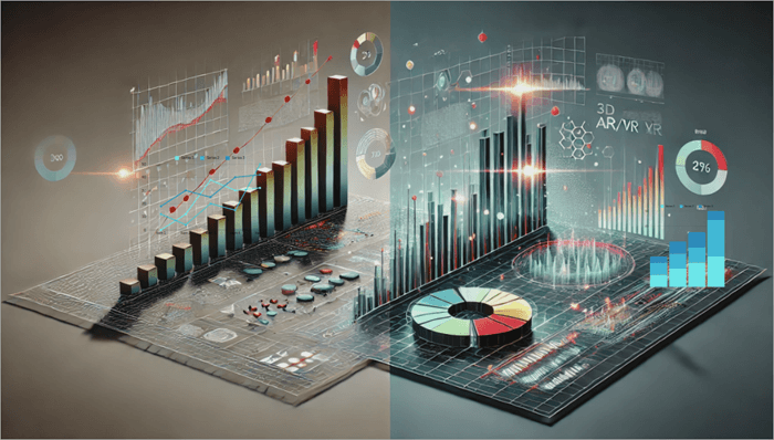
Gain insights into the powerful visualization capabilities of the Top AI Data Visualization Tools. Pick the right AI tool for data visualization to handle complex queries & revolutionize data interaction:
Lately, Data Analysis has been revolutionizing research powered by GPT-4 AI-driven tools. Data analysis and data visualization have become much more efficient accurate, creative, accessible, and insightful in almost every industry. Equally, it’s a nice-to-have skill to create smart data visuals. No wonder building good data visuals /graphical charts will become a need-to-have skill for managers.
AI (Artificial Intelligence) is making to think and changing the way organizations read and predict data analysis.
Data Visualization coupled with AI can do a lot of heavy lifting for data analysts, sales, and marketing teams assisting them to detect, understand the patterns and even predict the risks involved and look for any possible threats.
Table of Contents:
- AI Tools For Data Visualization to Transform Your Business
- List of the Best AI Data Visualization Tools
- Comparing the Top AI-Powered Data Visualization Software
- Best Free AI Tool for Data Visualization
- AI for Data Visualizations & Dashboards: Challenges & Considerations
- Frequently Asked Questions
- Conclusion
AI Tools For Data Visualization to Transform Your Business

Data Visualization refers to raw data (sometimes complex) that can be converted to visual formats, such as common graphics like plots, scattered plots, bars, pie or linear charts, and animations. Such graphical visuals are derived from simple to complex datasets so that it is easier to understand those patterns or insights better, even by non-technical teams and individuals.
Here is the video on how AI helps to enhance Data Visualization:
What is AI Data Visualization
Data Visualizations use AI (Artificial Intelligence) to process large amounts of raw data and convert them into pictorial representations, visual graphics, plots, and charts within seconds. This results in more creative, accurate, and customizable visual reports, unlike manually adding the data and calculating the results.
AI is specifically helpful & capable of handling large volumes of data and getting the results visual actionable insights to have better data-driven decision-making and predict upcoming patterns.
AI-powered data analysis tools enable effective and efficient interpretation the large volumes of data than traditional ways. This drastic shift has made most organizations rethink and enabled them to make quicker data-driven decisions, streamlining and automating their data analysis and visualization process.
Key Features of AI-Powered Data Visualization Tools
(AI KEY Applications Innovation used in Data analysis)
#1) Predictive Analytics
Example: In Finance, predict the average stock market trends.
#2) Natural Language Processing (NLP) technique
Example: NLP technique: Business owners are making use of these NLPs to analyze the feedback of customers and identify the areas of improvement! Be it in the services provided or in their products.
#3) Recommendation of Systems
Example: Online Retail owners can make use of recommendation systems in suggesting products that may complement the customers’ earlier purchases.
#4) Image and Video Analysis
Example:
- Medical imaging: AI helps in diagnosing diseases by analyzing the MRI & CT scans and X-ray reports
- Autonomous vehicles: AI helps in processing the camera’s visual data to navigate safely.
- Even in Surveillance: AI security cameras help to detect the differentiation between suspicious and normal activities and enable prompt alerts and any threats
#5) Identify Anomaly Detection
Example: Cybersecurity: AI algorithms can detect suspicious activity in the network which would signal hacking attempts.
The AI Data visualization tools help translate complex data into visuals based on the context of the data source fed to these tools within seconds to get visual insights.
Professionals using these AI Data Visualizations tools in the world mainly are:
- Data Analysts
- Business System Analysts
- Marketing and Sales Specialists
- Business Intelligence Analysts
- Researchers
- Finance
- Healthcare professionals
Some of the AI Data visualization standard examples professionals wish to use in their presentations or predictive analysis are:
- Pie charts
- Bar chats
- Scatter plots
- Animations
- Infographics
- Graphics
- Heat Maps
Data information is presented graphically using the above-mentioned Analytical tools to derive actionable insights, predict the risks involved, and make better decisions.
Why Organizations Need an AI Data Visualization Tool
Organizations are overwhelmed by the vast amounts of raw data collected from multiple sources, such as social media interactions, customer feedback, Sales transactions, marketing, supply chain metrics, and more. This is when the AI Data Visualization Tool comes into the picture.
The key reasons organizations need AI Data Visualization tools for their benefits are:
- Resources and Time Efficiency
- Decision-making improvements along with Data-Driven insights
- NLQ (Natural Language Querying)
- Collaboration and Communication increase within teamwork
- Scalability and Flexible Data Integration
- Organizations Competitive Advantages
- Advanced-Data Predictive Analysis
- Real-time Data Analysis and Decision-making
- Data Accuracy is improved with consistency
- Personalized insights with customization
How to Choose the Best AI Data Visualization Software
Let’s highlight the comprehensive tips/best practices for making the right choice when selecting the AI Visualization Tool:
- Business Objectives identification
- Usability is focused
- Ensure Integration and Compatibility
- Data Security, Compliance, and Privacy are Crucial
- Understanding Total Cost and Pricing Models
- Scalability and performance support system
- Users Support
- Evaluating Vendor Reviews and Reputation
- Conducting Proof of Concept (PoC)
Firstly, test the tool with a smaller team size with real use case scenarios and then evaluate the performance, data integration, and usability. Lastly collecting the feedback from the end-users’ perspectives on effectiveness and usability.
To conclude, selecting the best suitable AI Data Visualization tool is a strategic decision that purely depends upon the Organization’s unique demands, budgets, resources, and technical landscapes, which can guide them in making informed choices, which would increase the decision-making capabilities and drive the collective business growth.
How to Use AI for Data Visualizations
To achieve the following steps, from setting up data to generating insights, and to make the best use of AI features, first and foremost, you need to have a clear plan.
Well-Structured Data Preparation: AI-powered tools work well with sophisticated and high-quality data sources. Have this prepared and is handy.
Choosing the Right AI-Powered Tool: Based on your requirements and needs, select your AI-powered data visualization tools. For example, if you want to use them for interactive dashboards, specifically go for Domo and or ThoughtSpot platforms are best suitable.
Upload your Data Source: Using Database integrations, CSV, or Excel spreadsheets, you may load the data.
Such AI-powered tools are: ThoughtSpot and for Real-Time Data sources (which can be optional), Microsoft PowerBI, and Tableau integrated with APIs and Cloud based platforms.
Make use of AI capabilities to leverage the selected tool: For example, look for Natural Language querying and real-time data analysis, Patterns recognition, and automated recommendations on charts, Maps, and Dashboards(Generating Visualizations appropriately automatically) tools to make the best utilization of AI Capabilities.
Best examples of such features are Tableau, Microsoft Power BI, and Google Sheets platforms.
Customizations of your data visuals: Various Customization options are available to edit and enhance visuals, such as adjustments in colors, chart styles, and labeling. Dimensions and filters or drill-down facilities are available to interact with.
Tools like Tableau and Microsoft Power BI are providing facilities like AI-generated Captions too based on your contexts and can explain your key featured trends.
Further Reading => Most Popular AI-Testing Tools to Look For
Collaborations and sharing of the Reports: Tableau Dashboards allow users to Export their Data Visualizations and save them as PDFs, interactive Web Links, and also images.
Embedding options for dashboards to websites and sharing links for presentation via PowerPoint. Google Sheets and Flourish are the best suitable tools and have collaborative features for letting the team members take a view of your data visualizations and or edit those visuals.
Refining and iterating with the trends of your data visualizations:
Some platforms help optimize the data visual representation and also offer feedback.
The insights obtained from data visualizations can be refined by AI tools to identify the better trends and potential threats and risks involved and make better data-driven decisions regarding the business outcome.
Some of the tools, like Tableau, recommend the use of AI Feedback, which can signal overly cluttered visuals and optimize chart types.
The final step is to re-run the data analysis, wherein you update your data source if required and or tweak the queries as a new data source, then have the new insights available for your presentations and make better decisions.
What is AI Data Visualization Generator
AI Data Visualization Generators are tools that create the visual representations of your data (like charts and infographics) automatically with minimal user intervention in providing the inputs and need minimal customization.
- Some of the widely used examples are RAWGraphs, Visme, ChatGPT, and Canva for AI-driven template usage.
- Core features would include user inputs, focusing on outputs and automation.
- A couple of AI-powered generators help in leveraging to facilitate data visualizations:
- Visme: User-friendly interface will help in generating the infographics, which would be suitable for non-designers or non-technical users seeking to showcase their visuals at a professional level.
- Visme is an online graphics tool for data visualizations and is used to create, edit, share, and store visualization materials.
- More info can be found here on the official websites:
- https://www.visme.co/about/
- https://www.visme.co/pricing/
RAWGraphs is an open-source platform that is going to simplify the transformation of visual models and charts types of different data structures.
- RAWGraphs is a web-based data visualization tool written in Javascript.
- More info can be found here on the official website:
- https://www.rawgraphs.io/about
- https://www.rawgraphs.io/learning/what-is-rawgraphs-our-approach-to-data-visualization
List of the Best AI Data Visualization Tools
Given below are the top AI Data Visualization tools are available in both open-source (Free version) and paid versions.
- Tableau
- Julius AI
- Microsoft Power BI
- Zoho CRM (Zoho Analytics)
- Powerdrill AI
- ThoughtSpot
- Sisense
- Qlik Sense
- Google charts
- Domo
Comparing the Top AI-Powered Data Visualization Software
Based on the various key factors, below is the comparison table:
| Data Visualizations | AI and Analytics | Data Integration | Security and Governance | |
|---|---|---|---|---|
| Tableau | Advanced Visuals features and Highly customizable | Predictive Models with advanced AI driven analytics facility | More than 200+ connectors along with SQL, on-premises and cloud | Role bases accesses and Enterprise-grade level security |
| Julius AI | Based on the prompts, visualizations are generated automatically | NLP can perform the predictive forecasts and modelling with AI-powered Analysis. [NLP=Natural Language Processing] | Connects to various data sources which includes SQL databases, Excel and Google Sheets | Not specified at glance |
| Microsoft Power BI | Rich in customizations and has wide range of Visuals | Power BI-AI : AI-Driven insights | Has 100+native connectors and works best with Microsoft ecosystem. | Microsoft Compliance which has advanced security |
| Zoho Analytics | Multiple visualizations with customizations are available | For Predictive analysis and NLP queries Zia Insights is used | Has 250 + connectors including Cloud applications, CRM and Zoho Suite. | Secure Role-based access controls available |
| Domo | Interactive visuals and are Extensive | Machine learning and Powerful AI capabilities | Having 1000+ connectors which includes APIs, Cloud and databases. | Granular-level permissions available with Enterprise Security. |
Let’s dive into to best AI Data Visualization Tools and their core features in brief:
#1) Tableau CRM
Best for data analysts and enterprises who need deep insights.
Ease of usage: Powered with a drag-and-drop interface and is moderate in the learning curve.
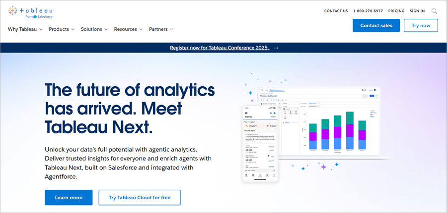
Tableau is one of the AI-powered analytical tools for data analysis and data visualization capabilities. Tableau is also termed as Salesforce’s AI platform and serves in Business Intelligence and Business Infrastructure where it connects to data sources, generates the dashboards of the raw data, and provides visual insights.
Tableau is considered one of the popular visualization tools with more advanced AI capabilities, such as natural language querying and predictive analysis. Integrates with multiple data sources like Salesforce, Excel, SQL, etc.
Tableau is best suitable for interactive dashboards, Business Intelligence, and enterprise-level insights.
- Integrates seamlessly with Salesforce Data
- Drag-and-drop interface
- Predictive Analytics
- AI suggested actionable insights
- Data blending is great where it combines the data from different sources of collective analytics.
Although Tableau is an emerging, excellent, and popular visualization tool, it has some disadvantages too, such as:
- Cost: Tableau is one of the more expensive tools compared to other visualization tools.
- Limited Collaboration capabilities
- Lacks version control capabilities
- Free and paid options are available.
- The paid version comes in 3 different slabs as
- Enterprise Viewer: £28 per month
- Enterprise Explorer: £56 per month
- Enterprise Creator: £92 per month
For more details, check the official websites below.
- https://www.salesforce.com/uk/analytics/pricing/
- https://www.tableau.com/en-gb/pricing
Website: https://www.tableau.com/en-gb/products/crm-analytics
#2) Julius AI
Best for individuals and small teams who seek AI-driven data analysis & insights.
Ease of usage: The learning curve is at a minimal- level and the Intuitive Chat-based interface
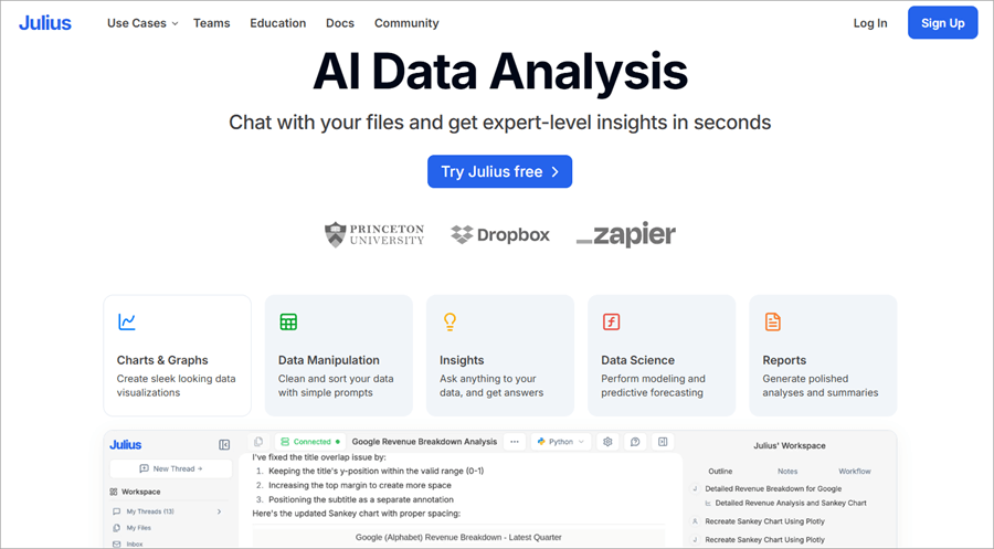
Julius AI is a promising AI assistant that can save hours for analyzing giant complex datasets, and data visualization tasks in seconds as it is designed to be intuitive with a user-friendly interface to get expert-level insights without much complexity. Also, can analyze various structured data, including CSV files, SQL databases, and Excel Spreadsheets.
Hence, Julius AI acts as an intelligent Data Analyst tool for having actionable insights, even for those individuals having no background in Data Science or Statistics Analysis.
- Simple Charts and Graphs
- Data Insights
- Advanced Analysis
- Problem-Solving capabilities
- Generate Sophisticated, polished summaries and analysis charts
- Requires a strong technical background to make use of the Advanced features and understand the complex dataset outcomes.
- The effectiveness of insights heavily depends on the initial Data Quality despite the data cleaning feature is provided.
- Free Plan: With this Free plan you can send up to 15 messages a month
- The Basic plan: $20.00 USD per month
- Essential Plan: $45.00 USD per month
- Pro Plan: $60.99 per month
- Team Plan: Centralized Billing
Check our Julius AI Review Here
#3) Microsoft Power BI
Best for businesses opting in Microsoft ecosystem, affordable BI.
Ease of usage: Excel-look a-like UI and user-friendly navigations.

Microsoft Power BI is popularly known as Power BI and was developed by Microsoft. It is one data visualization tool which integrates with the Microsoft products ecosystem. Microsoft’s Power BI is an AI-powered visualization tool designed for business intelligence and analytics. It offers a variety of options, from basic simple charts to advanced insights, and has data modeling capabilities.
- Has the capacity to analyze the real-time data monitoring and creation of dashboards.
- It is best for enterprise and real-time analytics and dashboard creations.
- Data modeling includes- cleaning up data and shaping and defining the relationships with Power Pivot and Power Query.
- Seamlessly integrates with Microsoft products and Microsoft’s Azure data platforms.
- Anomaly detection and insights findings are core AI-driven features.
- Limited Data security
- Power BI, User Interface is bulky
- Can have compatibility issues.
- Limited Customization features.
- Power BI offers both free and paid versions
- Power BI Pro: $10 per month
- Power BI Premium per user: $20 per month
- Power BI Embedded: Variable
- Contact them for more details on pricing.
Website: https://www.microsoft.com/en-us/power-platform/products/power-bi
#4) Zoho Analytics
Best for SMBs (Small & Mid-sized Businesses), especially those who are using Zoho Suite.
Ease of usage: Drag-and-drop builder feature and is user-friendly.
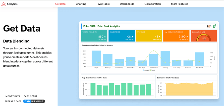
Zoho Analytics is one of the powerful cloud-based data visualization and Business Intelligence platform. Zoho is popularly well-known for its ease of use, affordability, and robust integration capabilities, making it go -to choice for SMBs (small to medium-sized businesses).
- Advanced-Data Visualization capabilities
- Data integrates comprehensively
- Zoho’s AI-powered assistant called ‘Zia Insights’
- Dashboards and reports are customizable
- Supports Mobile app access
- Embedded Analytics and Visualization capabilities
- Data blending and preparation are distributed well
- Real-time collaboration
- Advanced Analytics features
- Performance issues like lag on larger datasets
- Free Trial and Free plan users for 15 days free trial
- Basic Plan users: starts from £24 per month 2 users
- Standard plan: £48 per month for up to 5 users
- Enterprise and Premium plan: £116 per month, for up to 15 users and £460, for up to 50 users
Website: https://www.zoho.com/analytics
#5) Powerdrill AI
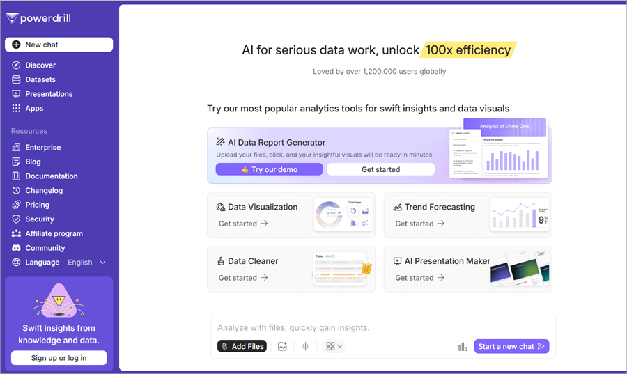
Powerdrill AI is one of the innovative tools that is designed for enhancing data-driven decision-making with AI- algorithms for deeper data visuals and actionable insights. This tool is been tailored specifically to help businesses to identify their sales optimizations, operations, and marketing roles swiftly.
It also makes use of predictive analytics and helps businesses drill down to the raw data, extract them, and look at actionable insights for their growth and efficiency.
Further Reading => Gradio vs. Streamlit: Which is the Best Framework
- Insights Automation
- Generates Real-time Data
- Advanced-Data Visualization
- Dashboard customization is possible
- Offers Predictive analysis
- offline functionality features are less.
- Over-dependency in community support, i.e. may face delays in attending to complex issues outside of the standard documentation.
- Languages support is limited: currently, English is supported and may hinder the support for non-English speaking users.
- Powerdrill AI offers both free and paid pricing plans
- Powerdrill AI comes in 3 subscription levels:
- Basic: $3.90 per month
- Plus: $9.90 per month
- Pro: $29.90 per month
- Contact them for more details
Website: https://powerdrill.ai
#6) ThoughtSpot
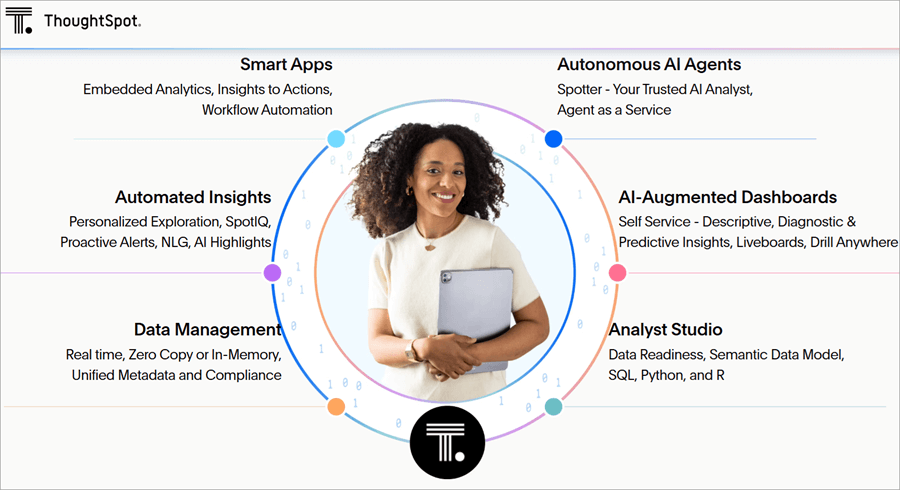
ThoughtSpot’s main focus is on Natural Language Querying and is regarded as one powerhouse in terms of Data Analytics, Data visualization, and Self-Service analytics.
ThoughtSpot’s innovation transforms liveaboards, interacts with raw data, and turns the static data to real-time and dynamic visual experiences. This is a powerful AI-driven tool for business intelligence and also for large-scale enterprise analytics. This tool is suitable for organizations with fluctuating analytical needs.
- AI-driven insights on anomalies and as well as trends.
- Dashboards are highly interactive.
- For non-technical users, the use of Natural Language querying is available.
- ThoughtSpot Lacks in fine-tuning the dashboard appearances.
- Customization of visual options is not sufficient.
- The process only handles files, lacking a direct database connection.
- Thought Spot offers a paid version only.
- Essentials Plan: $1250 Per Month up to 20 users
- Pro Plan: Starts at $2500 per month with Unlimited Users
- Enterprise Plan: Price Available upon request with Unlimited Users
- Contact them for more details.
Website: https://www.thoughtspot.com
#7) Sisense
Sisense is also a robust AI-driven analytical and Business Intelligence tool where in you and your team members can extract the datasets from multiple sources to generate visual insights.
Sisense is well known for embedded analytical capabilities and also includes open-source(free) integrations & access to RestAPI endpoints. However, recent reports claim extensive training sessions are required for the installation and setting up of complex data cubes.
- Scalability feature
- Embedded Analytical Capabilities
- Unique In-Chip Technology to Optimize
- Data Integration
- AI-Powered Analytics
- Customizable dashboards
- Sisense offers high-pricing plans.
- Sisense heavily relies on Third-Party Integrations for achieving the full functionalities.
- High Pricing plans.
- Sisense offers a paid pricing plan only (does not offer a free version, may contact the Sales team and request for demo trial).
- Sisense Pricing tiers come in:
- Basic Plan: $1000 per user per month
- Enterprise Plan
- Embedded Analytics Plan
For more info, request a quote from them.
Website: https://www.sisense.com
#8) Qlik Sense
Qlik Sense is one of the most robust AI-powered data analytical tools for data visualizations and getting visual insights. It is best used for enterprise collaboration across teams and has advanced analytical capacities. Also, Qlik Sense is providing the Business free trial version and helping users find insights and make much quicker decisions.
Qlik Sense has robust Visualization and Analysis capabilities but is worth considering regarding limitations when dealing with larger datasets.
- Augmented intelligence for trends insights ie ask questions or use AutoML and perform predictive analysis.
- Can set up the automation and alerts, and monitor live reporting with real-time collaboration and interactive visualizations.
- Data integrates and is capable of storytelling features.
- Qlik Sense may experience performance issues with larger datasets, which leads to response time slowing down and causes potential data analysis delays.
- Excel Integration seamlessly is limited.
- License Structure might be complex.
- There are 3 different pricing models available for the Qlik Sense tool, such as
- Data integration tool
- Analytics Pricing
- AI /ML Pricing
- Contact them for more detailed pricing.
Website: https://www.qlik.com/us
#9) Google Charts
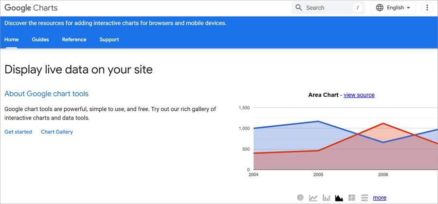
Google Charts is a user-friendly, free data visualization library developed by Google. It enables users to create interactive graphics for web-based applications using JavaScript, SVG, and HTML5. Specifically, for integrating dynamic visualizations to dashboards and websites, developers are widely opting for Google Charts.
Google Charts is ideal for small businesses, students, any start-ups, and developers requiring lightweight, free easy-to-use visualization tools.
- Handles Cross-browser compatibility gracefully
- Binds data dynamically
- Highly customizable
- Wide-range of charts
- Interactive visualization features
- 100% free and easy to use
- Responsive in nature for all categories of screen sizes
- Supported Data Sources areas
- Lacks a dedicated set of team for Customer Support since it is a free tool, users may have to rely on the community forums, Stack Overflow, and Google Documentation for any troubleshooting issues.
- Handling Larger Datasets may cause performance issues.
- Active Internet connection dependency.
- Google Charts is completely Free to use for users, no licensing costs, usage limits, or subscription costs are involved.
- Hosting and processing of the data is handled by Google, making the process more cost-effective.
- Without any financial commitments, users can create, and share any unlimited charts, and even embed them.
- If Google Cloud Services (like Cloud computations and Cloud Storage) are utilized, for example, Big Query for data processing Costs may be applied, and that too depends on the volume of the data stored and data processed
Website: https://developers.google.com/chart
#10) Domo
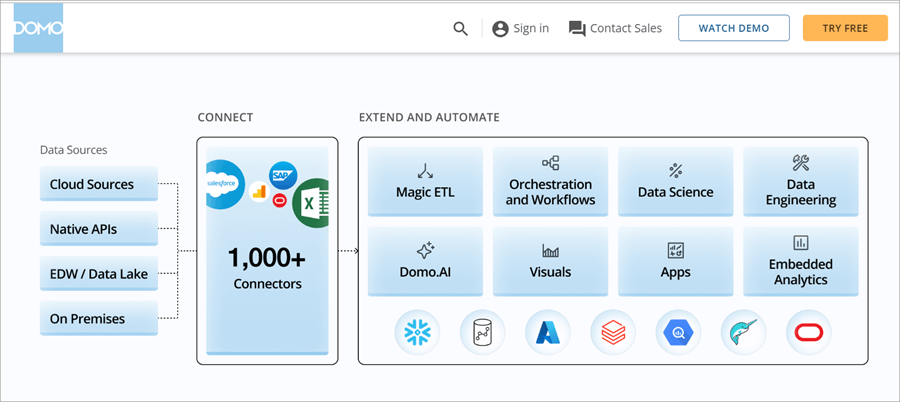
Domo is one of the cloud-based Business intelligence (BI) and data visualization tools for real-time data visual insights. It has a user-friendly interface to create dashboards and interact with and get visuals by integrating with a wide range of data sources. For businesses seeking to scalable solutions with collaboration-featured facilities, Domo is well-known and popularly used.
- Data Governance features and security
- Cloud-based Architecture
- Optimized for Mobile devices too
- Domo App creation is the highlight!
- Machine Learning and AI
- Real-time Dashboard creation and Data integrations
- Cloud processing speed may be slower on certain larger datasets.
- Domo operates on Consumption-based modeling which may pose unexpected costs for data storage, transformation, and ingestion.
- Lacks in Pricing Transparency.
- Domo platform offering both Free and various Paid options to cater for different organizational needs.
- Different Domo platform’s pricing plans are:
- Free Plan
- Standard Plan
- Enterprise Plan
- Business Critical Plan
Note: Pricing is tailored to organizational requirements, hence, having direct consultation with the Domo platform is a necessary task for exact pricing plans.
- Contact them for more information on Domo’s AI-powered capabilities
Website: https://www.domo.com
Best Free AI Tool for Data Visualization
- There are many free AI tools for Data visualization considering their usability and capabilities stacks. Also, for various user-levels, like for Beginners-level, Advanced-level and interactive level.
- Beginners-level tool: Google Sheets
- Advanced-level tools: RAWGraphs, Tableau
- Interactive-level: Canva
Let’s see each of those tools descriptions in brief:
#1) Google Sheets
Google Sheets has a special feature, the AI-powered “Explore” feature to generate actionable insights, and can suggest various kinds of charts based on the datasets you fed to the platform.
Another eye-catching feature is you can make use of NLP, yes Natural language querying is possible, and ask queries related to your data source. Example: “Show me an average sales by Region”.
This tool is best for Beginner level users.
Advantages:
- Free for individual users
- Can use Natural Language Querying,
- Can integrate with other Google Workspace tools seamlessly
#2) RAW Graphs
RAW Graphs is an open-source platform and data visualization generator that converts and transforms your data source into various visual formats. This is best suitable for those seeking a bit of creativity, customization, and advanced chart visuals.
Advantages:
- No prior coding experience is required
- Free and open-source tool
- Highly customization options available
- Can handle highly complex data sources, for ex multidimensional data
Tableau Public:
Tableau is one of the most popular used and available in free versions for generating interactive dashboards and sharing them online instantly.
Users wanting to produce Professional-level visuals without fully paying for the paid version suits.
Advantages:
- Tableau’s visualization power is Free to access
- Integrating well with other multiple data sets
- For Easy collaboration, public sharing of dashboards is possible
- Drag-and-drop feature is also a highlight.
#3) Canva
Canva is mainly a designing tool, which has AI built-in features for creating the visuals like charts and graphics insights. Users like Marketing experts, sales professionals also beginner-level individuals can opt for this tool for quicker and highly polished visual presentations.
Advantages:
- Canvas pre-built templates are handy and beginners too
- Integrates AI in suggesting the design templates
- It is free to use with premium upgrade facilities.
#4) Microsoft Power BI
Microsoft Power BI also offers a free version with robust analytical features. Users like businesses and individuals who need AI-driven tools for their Dashboards and insights can opt for this tool
Advantages:
- Power BI supports the integrations with SQL and Excel.
- It provides very rich user interactive visualizations.
- It’s great for its AI capabilities for predictions, and Natural language Querying, as well as trends.
AI for Data Visualizations & Dashboards: Challenges & Considerations
Let’s address the challenges that organizations may face & considerations for those challenges are:
1. Challenge: Resources and Cost Requirements
Consideration: Adopting the cloud-based and scalable possible solutions and evaluating on ROI of Data visualization so that the upfront costs are minimized.
2. Challenge: Integrate with existing/legacy systems.
Consideration: The tools that provide the integration support and offer the flexible API can help down the line and also plan for the data migration and carrying out compatibility testing activities.
3. Challenge: Data Privacy and Data Security
Consideration: The above challenge is to make sure having the comply with the Data Protection guidelines and regulations like GDPR(General Data Protection Regulation).
4. Challenge: Selection of the right Model and its complexity.
Considering the collaboration with Data scientists for any advanced AI modeling requirements and also considering the usage of AutoML (Automated Machine Learning) tools for automating the selected models.
5. Challenge: Data source Quality and integrity of the same
Consideration: regular implementation of data cleaning and validation checks to be carried out, along with establishing the governance policies to maintain the accuracy and consistency of the data sources.
6. Challenge: AI-driven dashboard adoption and Trust
Considering the transparency during the AI Model development and validation cycles. Provide proper training and educate users about the AI -capabilities, and vulnerabilities/Limitations. Also encouraging the Data-driven culture in the team.
7. Challenge: Likely to have Biases and Ethical concerns.
Considering the continuous auditing of AI models bias can be overcome. Making sure the transparency and AI-driven insights explainability in details can avoid such situations.
8. Challenge: Difficulty in Interpretability and Explainability at times.
Considering the special technique XAI (Explainable AI Techniques) to provide the reasoning and contextual predictions and also narrative explanations can be integrated alongside the data visualizations.
9. Challenge: Real-time large datasets Scalability and Performance
Considering the Cloud-based AI platforms and optimized datasets pipelines for Scalability and Performance respectively could leverage the process.
Frequently Asked Questions
1. Key differences between ‘AI Data Visualization Generators’ and ‘AI Tools for Data Visualization’?
AI Generators are more light-weight and focused tools particularly and primarily utilized for visual creations for very simple and quickly doable tasks.
AI Tools are way robust and for broader platforms with AI capabilities for any in-depth data analysis, data visualizations, and actionable insights. Tools are ideal for enterprise-level organizations and for strategic application handling.
2. What are Interactive Dashboards?
Every business has to deal with the data management.
Interactive dashboards are Business Data Management Tools and are dynamic, i.e they allow the users to interact with their raw data, track the data by analyzing, extracting, transforming, and monitoring KPIs in real-time to drill down the data and display the key business matrices of an organization.
Core features of Interactive Dashboards are:
1. Customization Facilities
2. Drill down Features
3. Real-Time Collaboration
4. AI-Assistance
3. What are the 5 Types of Data Visualization Charts?
Data visualization charts are in wide ranges and are catering to different data sources and respective goals. Among them, 5 most popular Types of Data Visualization Charts are:
1. Maps
2. Scatter Plots
3. Pie Charts
4. Bar Charts
5. linear charts
Conclusion
Trends in 2026, AI is automating and improvements in accessing the data undoubtedly going to reach new heights. AI-powered tools will certainly be offering data visualizations and on-the-spot suggestions such as interactive dashboards, scatter plots, and heat maps which improve the data clarity and impactful of data presentations and publications significantly.
Research Process:
- Time taken to research this article: We spent 25 hours researching and writing this article so you can get a useful summarised list of tools with a comparison of the top 5 for your quick review.
- Total AI Data Visualization tools researched online: 35
- Top tools shortlisted for review: 10
Was this helpful?
Recommended Reading
-

Select the best AI Voice Generator from the list of many computer voice generators available in the market today for amazing results: Voice cloning technology has been around for a while now and has undergone several impressive changes since its initial years. It was once a tool used vehemently for…
-
List of the Best Artificial Intelligence AI Software With Reviews And Comparison. What is AI Software? Artificial Intelligence (AI) Software is a computer program which mimics human behavior by learning various data patterns and insights. Top features of AI software include Machine Learning, Speech & Voice Recognition, Virtual Assistant etc.…
-
Read this Comprehensive Review of the Top AI Chatbots with Pricing, Features & Comparison to Select the Best AI Chatbot for your Requirements: What Are Chatbots? Artificial Intelligence (AI) chatbots use machine learning to converse with people. The first-ever AI chatbot was developed in the 1960s by Joseph Weizenbaum, a…
-

Quickly evaluate the Top Generative AI Security Solutions that enable businesses to maximize the advantages of GenAI thereby ensuring protection against data leaks: Generative AI is ripe with opportunities for enterprises. However, the explosion of generative AI has also introduced new risks to organizations. This is not necessarily due to…
-

Deeply explore the best-rated AI Field Management Software solutions with features and pricing. Choose the right tool to optimize and streamline your field operations perfectly: The realm of fieldwork isn’t easy. It is hectic and ripe with issues of mismanagement. Miscommunication, overscheduling, absent workers, and missed appointments are some typical…
-
Level up your programming game with the top-notch AI coding tools. Compare the prominent AI code generators to pick the right AI tool for coding to boost code quality: With the revolutionary change of artificial intelligence, the way software developers and engineers work has completely changed. Writing code, debugging, interacting…
-
Enhance your hiring process with the top AI Recruiting tools in the market. Use the right AI recruitment software to simplify and automate multiple hiring tasks quickly and smartly: Recruitment is the most challenging function an organization must tackle for its survival and growth. Ask any professional tasked with recruiting…
-

Discover all about the unique features and character creation capabilities of Janitor AI along with its alternatives. Converse with the fictional AI characters of your choice and customize as per your needs: Conversational AI tools are finding varied applications in offering automated customer support, supporting online searches by providing relevant…